
Data Analysis
So what have we learnt so far?

Since I started this newsletter in September, I have published 31 entries on album closers, 30 of which are on Spotify and are included in the playlist below;
The missing entry is De La Soul’s 3ft High and Rising, and I also now know that I am likely to hit the same issue with Neil Young albums after this week’s news1. Regardless, I will push on with this piece of work using Spotify Audio Features to examine what our 30 eligible entries so far tell us about closing tracks.
Firstly, let’s look at a breakdown that doesn’t require SAF, release dates;
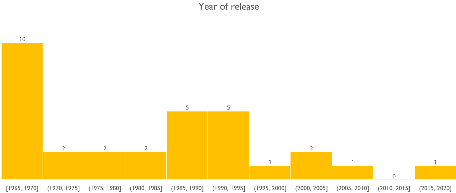
This isn’t telling us all that much, so far, the entries have been based on counting down Acclaimed Music’s top 100 albums, and this happens to be how those 31 albums look. Only Blackstar and In Rainbows from the most recent years and already almost a third of the entries fall into the 1965-69.2 I expect that once we roll into the second year of this newsletter and beyond, there will be a shift to more modern acts as I start to choose the tracks myself.
There are two other fundamental data points we can look at for each of the songs; Length and track number.
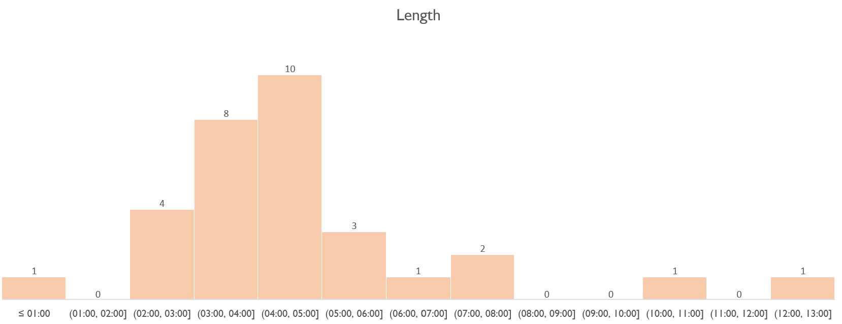
So far, almost all of the selections are between two and eight minutes, with John Lennon/Plastic Ono Band’s ‘My Mummy’s Dead’ coming in below a minute and closers by Miles Davis and The Beastie Boys3 over 10 minutes. What interests me, though, is we still have the four to five mins bin as the most popular even with so many songs in the 1965-70 section. Excluding Lennon would mean the average of those nine songs was approaching four minutes in an era where a single would be expected to come in under three-and-a-half for radio play. Already, we see the tendency to draw out that final track coming in.
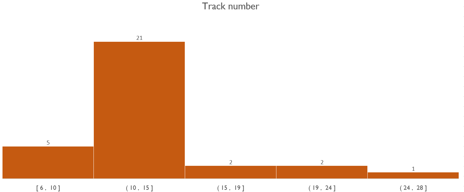
On track number, it’s not a surprise to see the vast majority of albums have 11-15 tracks with only a handful going to the extreme of having half or double that number.
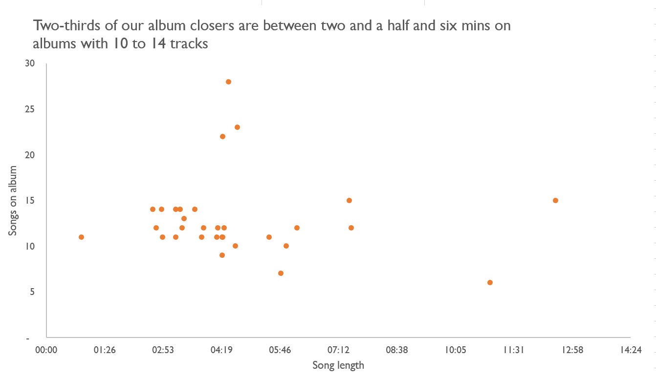
Combining the two shows that so far, our albums have around a dozen tracks and are three to five minutes long with outliers in all directions.
Spotify Audio Features
Coming back to these now, it is worth inserting definitions, so we know where we are.
As per Spotify Web API developer guide;
Danceability: Describes how suitable a track is for dancing based on a combination of musical elements including tempo, rhythm stability, beat strength, and overall regularity.
Valence: Describes the musical positiveness conveyed by a track. Tracks with high valence sound more positive (e.g. happy, cheerful, euphoric), while tracks with low valence sound more negative (e.g. sad, depressed, angry).
Energy: Represents a perceptual measure of intensity and activity. Typically, energetic tracks feel fast, loud, and noisy. For example, death metal has high energy, while a Bach prelude scores low on the scale.
Tempo: The overall estimated tempo of a track in beats per minute (BPM). In musical terminology, tempo is the speed or pace of a given piece, and derives directly from the average beat duration.
Acousticness: A confidence measure from 0 to 100 of whether the track is acoustic.
Now we know that even with our initial 30, there’s a great deal of variance on each of these scales, and we can see that below.
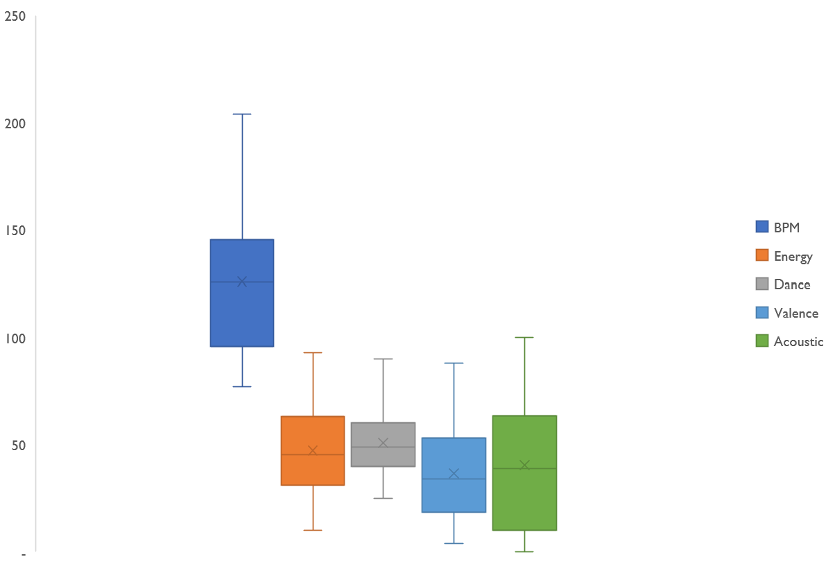
So this isn’t telling us much interesting. I’ve found it much more helpful to compare the closer on each album with its obvious comparator; the first track. I’ve also looked at the most played song on the album.4
Song length
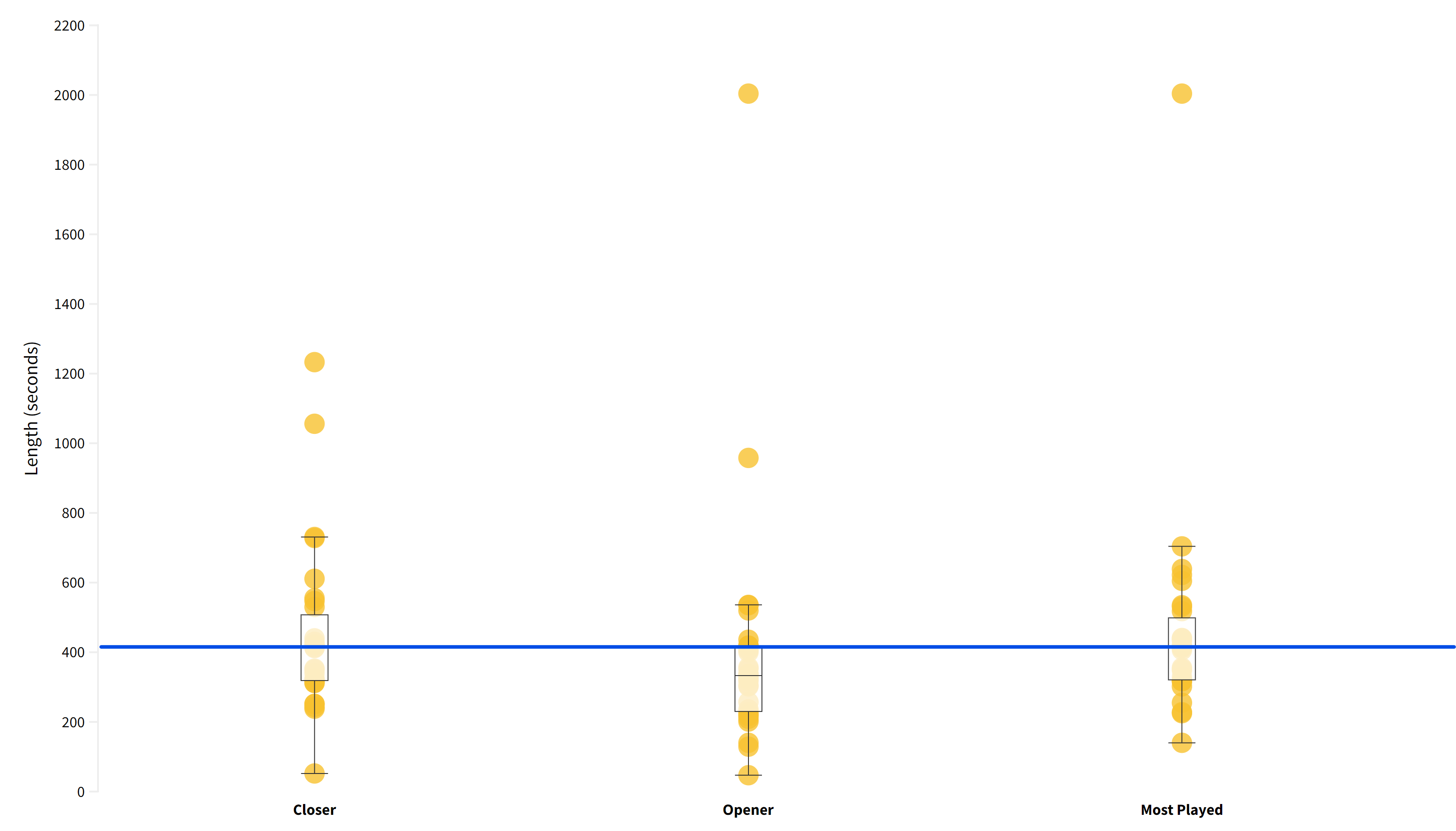
These box plots show that the 30 closing tracks are longer than the opening ones. We can see that the median closing track is as long as the 75th percentile for opening tracks. We notice that the most played tracks on these albums are as long, but there is minor variation - fewer long tracks and fewer concise tracks.
Song popularity
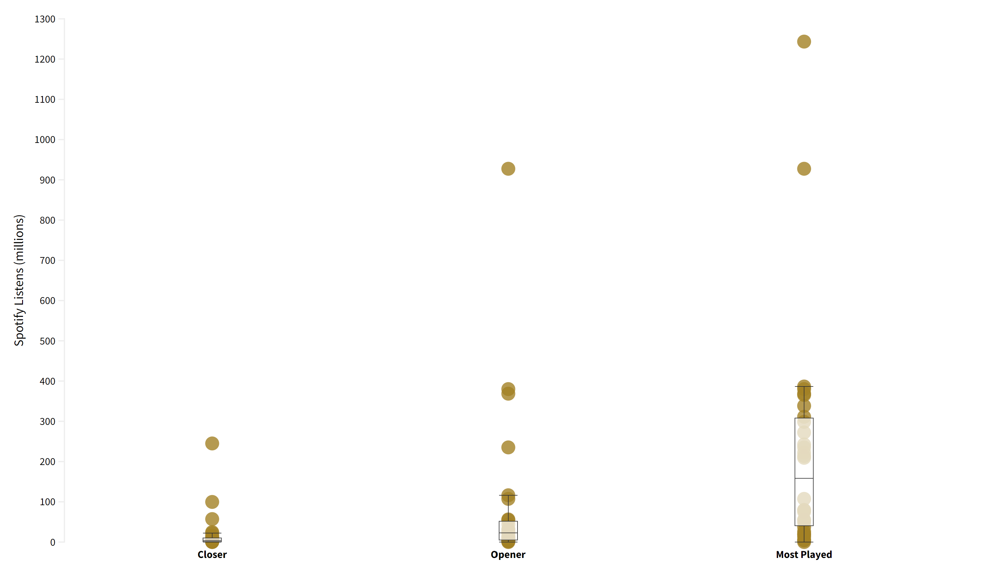
We can also look at the popularity and, as you’d expect, the most played song wins this category easily. Two points, though, openers are more popular than closers - some of which is an artefact of listeners not completing a full listen to an album or that an opener is more likely to be a single.
I don’t intend to post every possible graph from this data, but it is worth looking at one more.
Happy/Sad?
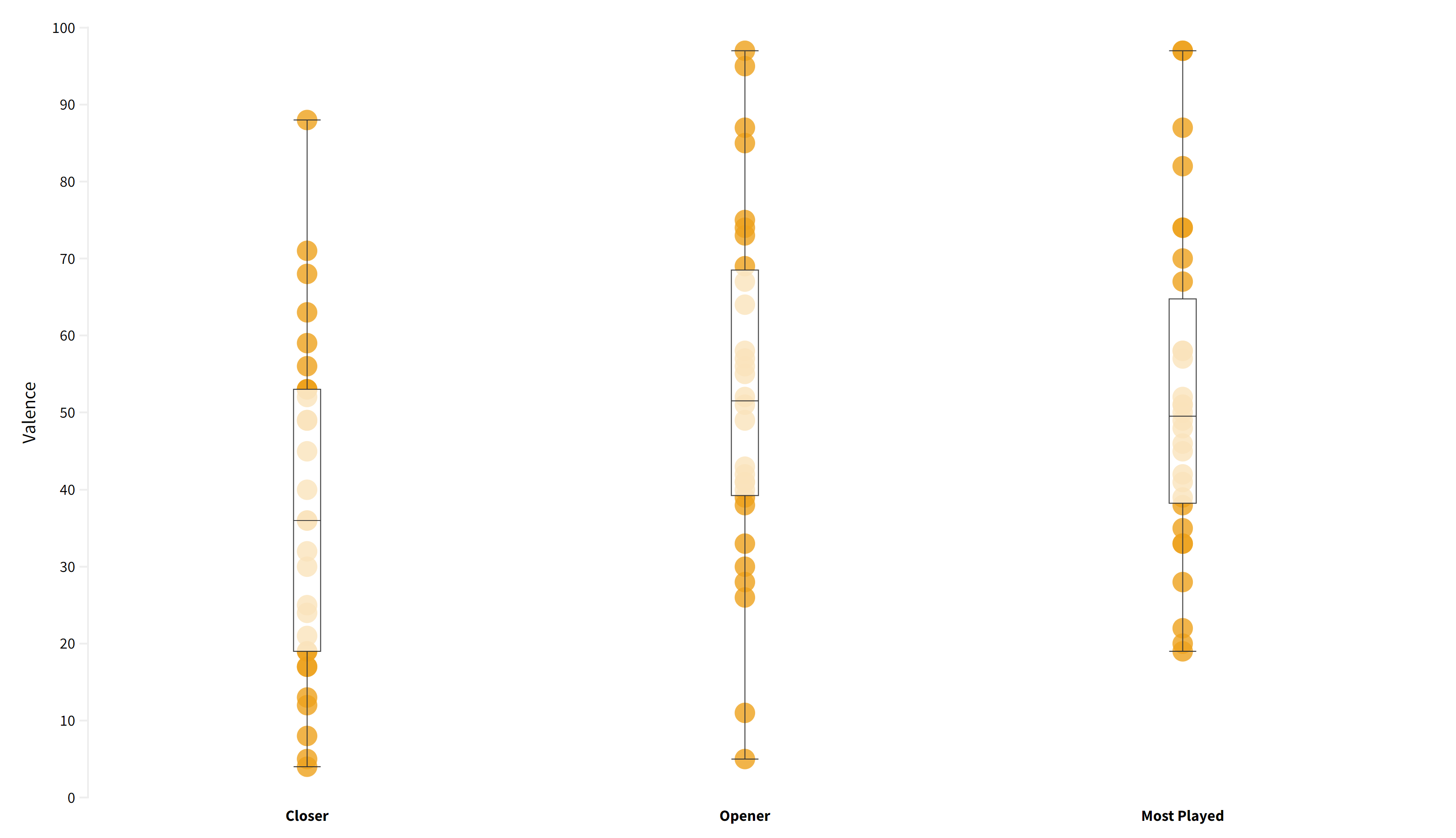
Closing tracks are less positive than openers and the most popular songs from those albums. This interests me as these are the same 28 artists; we aren’t comparing these 30 songs with the current top 40 - these are songs on the identical albums recorded as happier, cheerful and euphoric by Spotify.
Conclusion - for now
To round up without all of the graphical detail based on the thirty tracks so far;
Closers are longer than openers; they less popular than openers. They have a more negative tone, roughly similar BPM, and are less likely to be danceable. We also know they are significantly quieter and more likely to be acoustic compared to both the openers and most popular tracks.
With the data so far, the track closest to resembling an average of all these metrics is Aretha Franklin with ‘A Change Is Gonna Come’ from 1967’s I Never Loved A Man The Way You Loved Me.

I hope you have enjoyed this data diversion; I intend to return to these numbers once we are two-thirds through the top 100 and at the end. With more data, there will be scope to make more comparisons and see what marks a final track different.
If you haven’t enjoyed it - you won’t see it again for months, and regular service will resume next week with Carole King and The Clash.
If anyone is interested - I fully support Young’s intervention, and with me now in my fourteenth year of being a subscriber - I was there for the “Hi, I’m Roberta from Spotify” adverts - I would be greatly pained to come off the platform with the thousands of hours I’ve spent on hundreds of playlists. But I am glad that Young has taken a stand and others are doing so in their way.
The histogram bins have curly and square brackets; curly means the value is excluded, and square is included. So, [1965-1970] means 1965 to 1970, inclusive whereas (1970-1975) means 1971-1975.
A track is split across two or more in Spotify; the data is weighted to the segments length and aggregated. For example, DJ Shadow’s ‘What Does Your Soul Look Like Pt 1 / Blue Sky Revisit’ and ‘Transmission 3’ have BPMs of 156 and 97, respectively, and the former is five minutes longer than the latter. So a weighted average of 147 is used.
By Spotify play count.
Very impressive work.